Visualization Types
Different types of data need different visualizations. This is why overview widgets give you an option to choose from multiple visualizations to best represent important information.
Depending on the widget, you will be able to choose from various visualizations. Each visualization type has different elements that can be configured. To find out more about each type of visualization, please read below.
Pins, Pin from Dashboards, Bookmarks, Text Widget, and Unread Mentions don’t use visualizations.
The Member Tasks Summary and the Member Tasks by Status widget don’t use visualization types but you can change their default settings based on what your business goals are.
Visualization Types
You can use visualizations for out-of-the-box task, project, and workspace widgets, as well as for dashboards and custom widgets.
Task Widgets
When you create custom task widgets or use the task widgets from the Task Management category, you can choose between all nine visualizations.
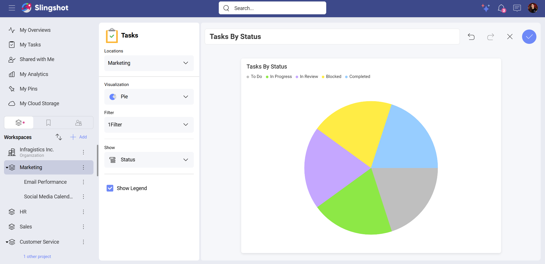
Pie
If you want to use slices to display numerical proportions, you can use the Pie visualization. While using the Pie visualization, you can add filters as well as show the legend.
For example, if you want to see how many tasks you have in a workspace, categorized by Status, you can:
Select Tasks By Status from the list of widgets.
Open Locations to select the workspace.
Select the Pie visualization.
Set the Filter value to Dynamic Me.
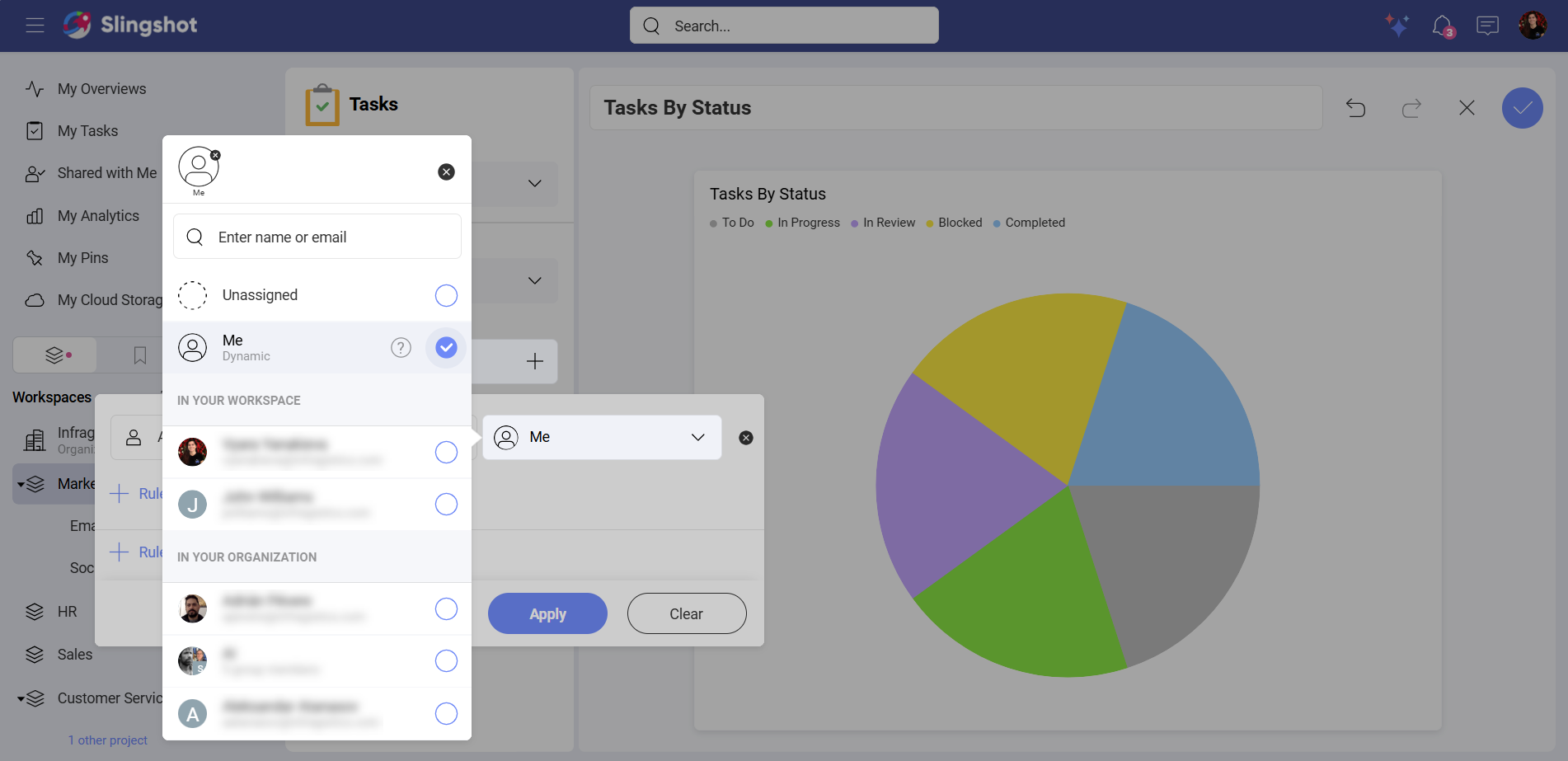
Open the dropdown menu of Show and select Status.
Enable Show Legend. This way you can see all the names of your statuses.
Note
If you use the Open Tasks By Project widget, you can also filter the tasks by End Date, Start Date, Status and Title.
Note
When you choose a widget from the Task Management category in My Overviews, you can also add a Value while using a Pie visualization.
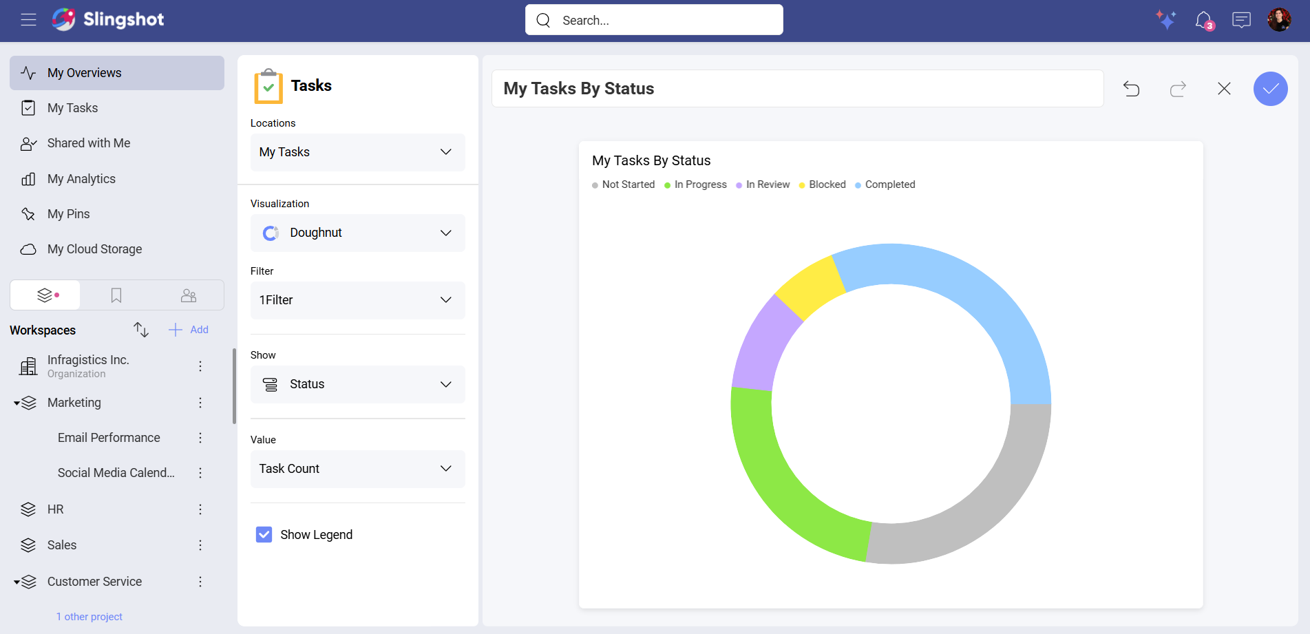
Doughnut
The Doughnut visualization provides you with the same customization elements as the Pie visualization. You can add filters, decide what data to show and enable or disable the legend.
You can also add a Value if you are using a widget from the Task Management category.
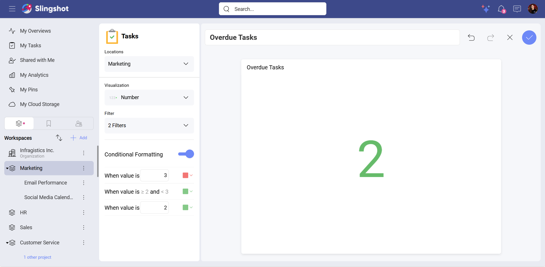
Number
You can use the Number visualization to display data with the help of filters and conditional formatting.
Note
The Number visualization is available for the task widgets in the Task Management category as well as for custom task widgets.
For example, you want to see how many tasks are overdue in a workspace. To do that, you can:
Select Overdue Tasks from the list of widgets.
Open Locations to select the workspace.
Select the Number visualization.
Set the Due Date to Today.
Create a Status filter that excludes Completed tasks.
Add specific conditions. In our case, we wanted to have the number to be in red if it was greater than 3 and to be in green when it was less than 2. (optional)
Note
When you use a widget from the Task Management category in My Overviews, you can also add a Value while using a Number visualization.
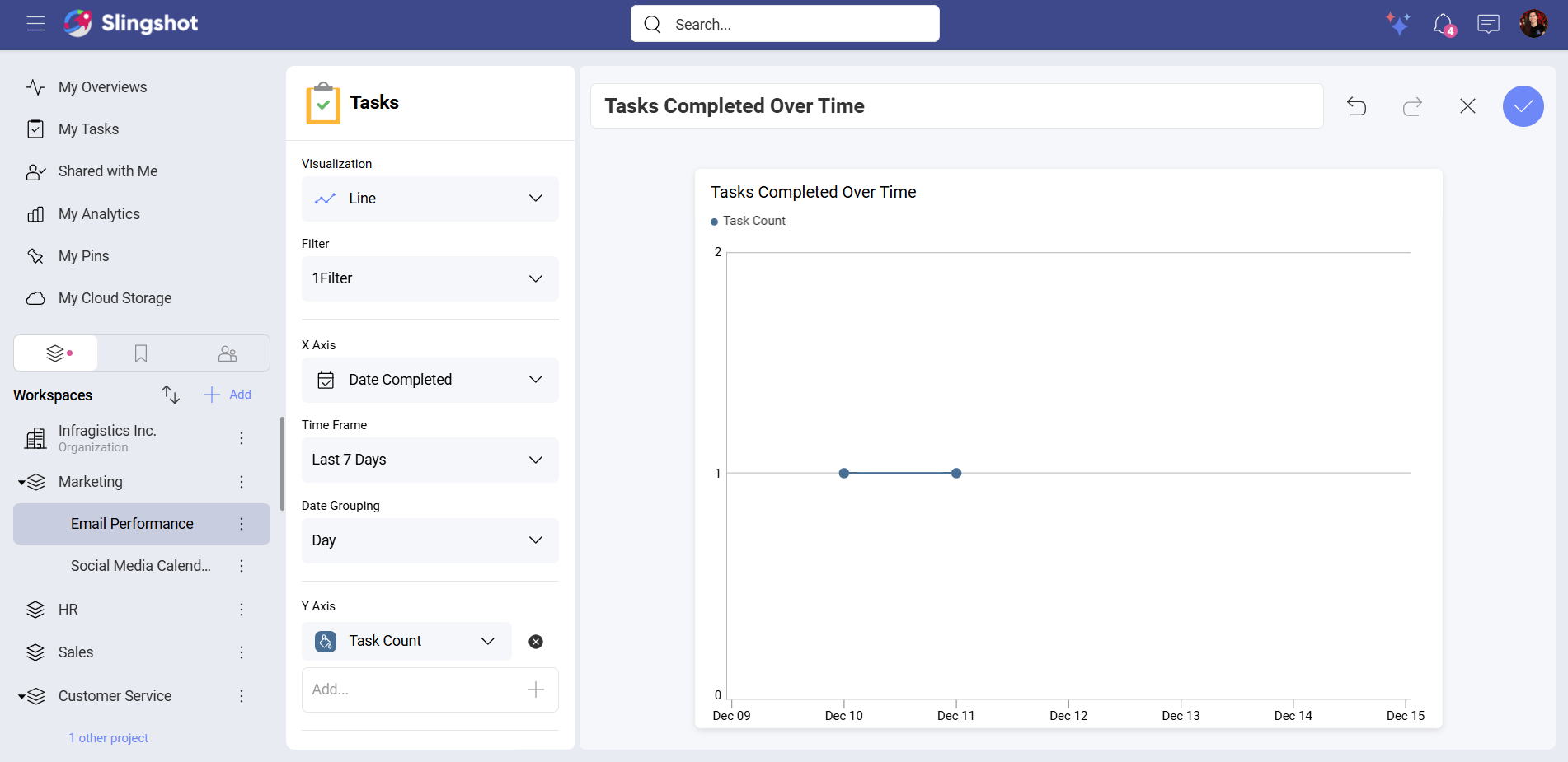
Line
You can use the Line visualization when you want to display trends over time. You can add Filters, X Axis and Y Axis as well as set up the Time Frame and group tasks by Date. For better overview of the data, you can also enable the Legend.
For example, you want to see the tasks you have completed in a project over the last 7 days. To do that, you can:
Select Tasks Completed Over Time from the list of widgets.
Select the Line visualization.
Set the Filter value to Dynamic Me.
Open the dropdown menu of X Axis and select Date Completed.
Add Task Count to Y Axis.
Add the Time Frame you have in mind. In our example, we chose Last 7 Days.
Set up the Date Grouping. In our example, we chose Day.
Note
You can set up Time Frame and Date Grouping only while using the Tasks Completed Over Time widget. The rest of the task widgets in the Task Management category don’t have these elements.
Note
When you use the Open Tasks By Project widget, you can also set up a Task Filter.
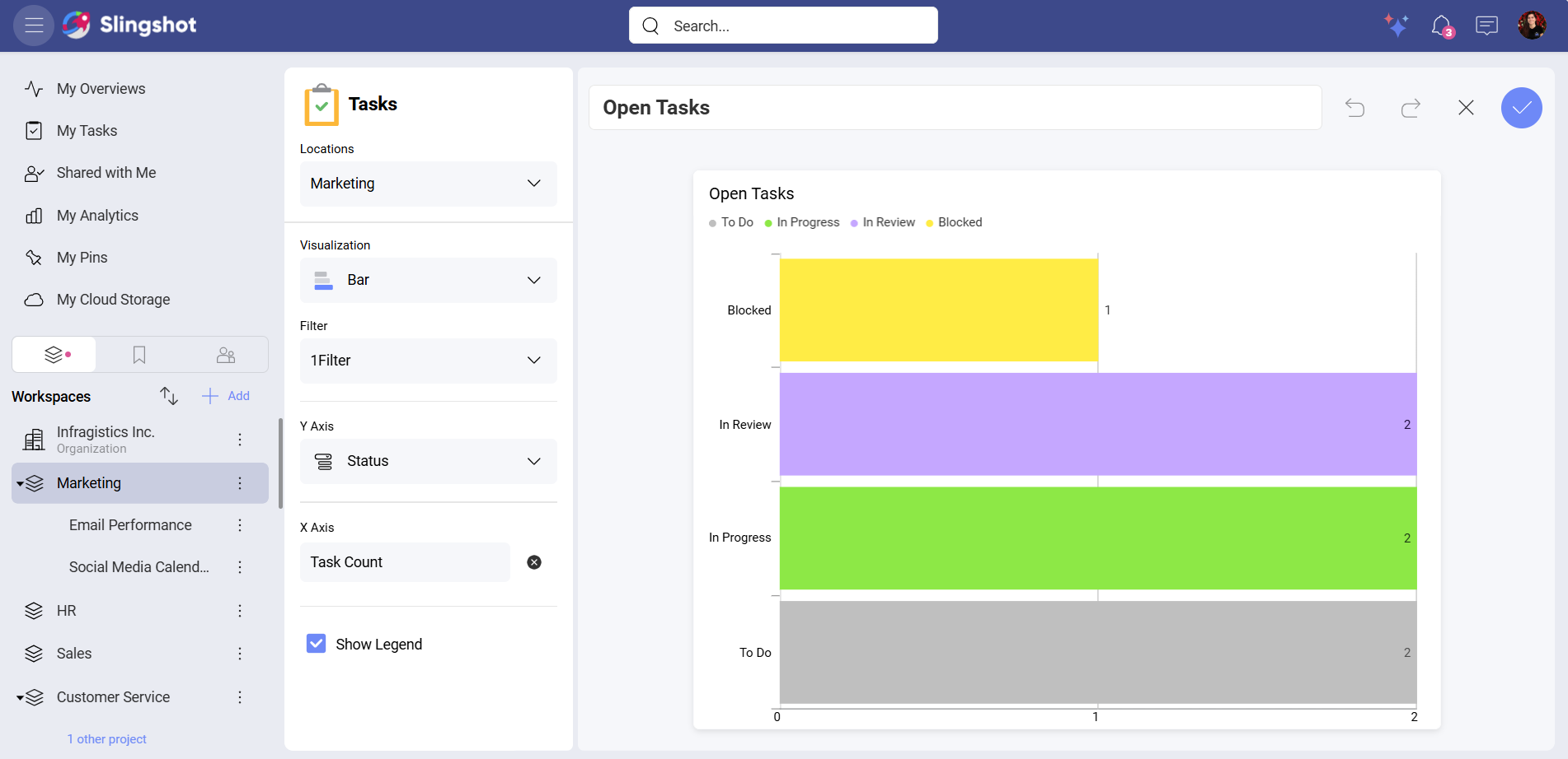
Bar
You can use the Bar visualization when you want to compare values across multiple categories. You can add filters, X Axis and Y Axis, and hide/show the legend.
For example, you want to view all the open tasks in a workspace. To do that, you can:
Select Open Tasks from the list of widgets.
Open Locations to select the workspace.
Select the Bar visualization.
Create a Filter for Status with a value different than Completed.
Open the dropdown menu of Y Axis and select Status.
Add Task Count to X Axis.
Enable the Legend.
Note
You can also set up Time Frame and Date Grouping only while using the Tasks Completed Over Time widget. The rest of the task widgets in the Task Management category don’t have these elements.
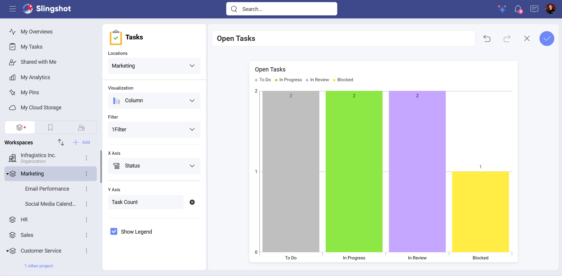
Column
The Column visualization is similar to the Bar visualization in terms of customization. You can configure the same elements. The only difference is that you will see a dropdown menu for X Axis and will be able to select values, such as Task Count, for Y Axis.
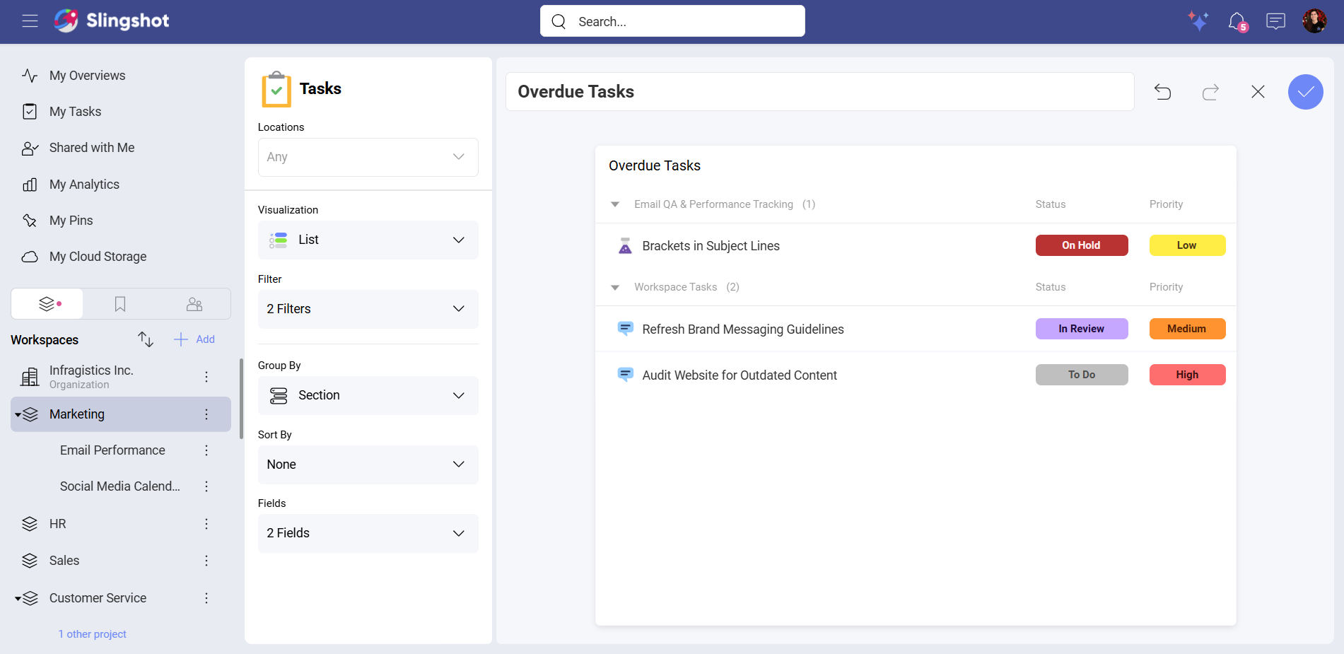
List
You can use the List visualization if you want to have the data displayed in a grid format. With the List visualization, you can filter, group and sort tasks.
Note
The Group By element is available for the widgets in the Task Management category as well as for custom tasks.
For example, you want to see detailed information about how many tasks in your workspace are overdue. To do this, you can:
Select Overdue Tasks from the list of widgets.
Open Locations to select the workspace.
Select the List visualization.
Create two filters: One for Due Date with a value that is before Today and one for Status with a value that is different than Done.
Open Group By to select a value. In this example, we chose Section.
Select fields. In this case, we chose the Priority and the Status field.
Select a value for the Sort By element. (optional)
Note
The Group By element is available for the widgets that are in the Task Management category, as well as for custom tasks.
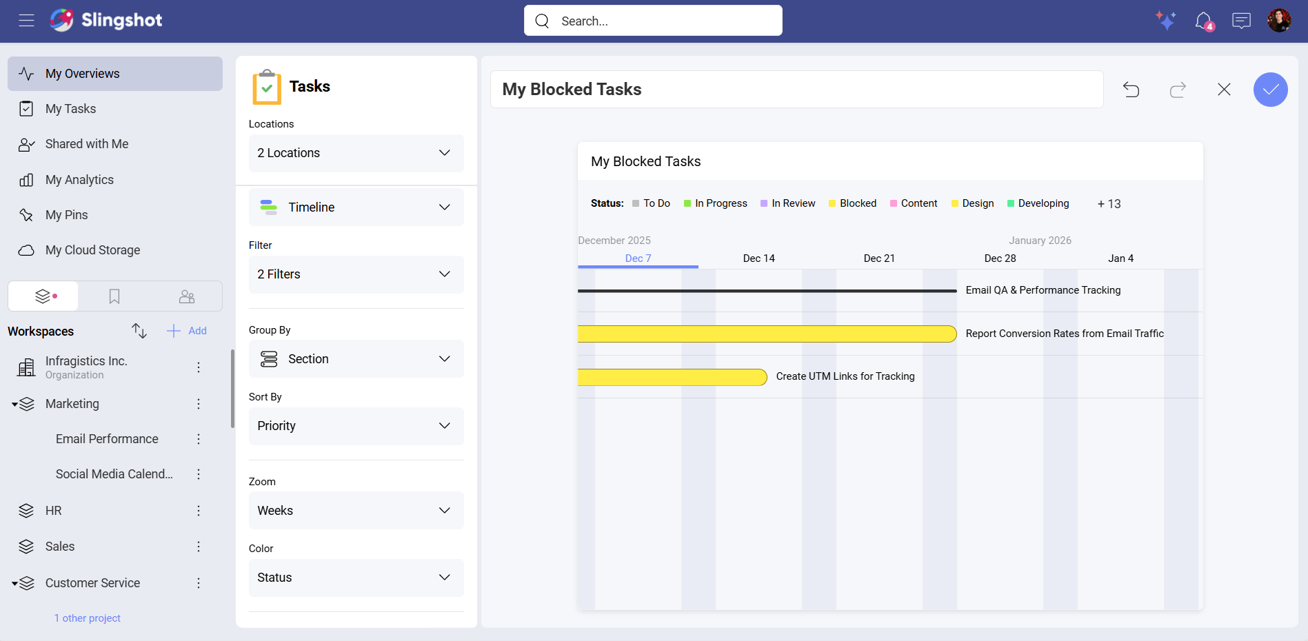
Timeline
You can use the Timeline visualization to display data in a chronological order.
For example, you want to see detailed information on all of your blocked tasks in each project that you are a part of. To do that, you can:
Select My Blocked Tasks from the list of widgets.
Open Locations. Here you can mark the projects you want to extract the data from.
Select the Timeline visualization.
Create two filters: One is for Assignees with a Me value, and the other one is for tasks with a Blocked status.
Open Group By to select a value. In this example, we chose Section.
Select a value for the Sort By element. In our example, we chose Priority.
Select a timeframe. In our case, we chose Weeks.
Select a color. In our example, we chose Status.
Enable the Legends. (optional)
Enable the Weekends. (optional)
Note
The options to Group By and Sort By are available for all the widgets that are in the Task Management category as well as for custom tasks.
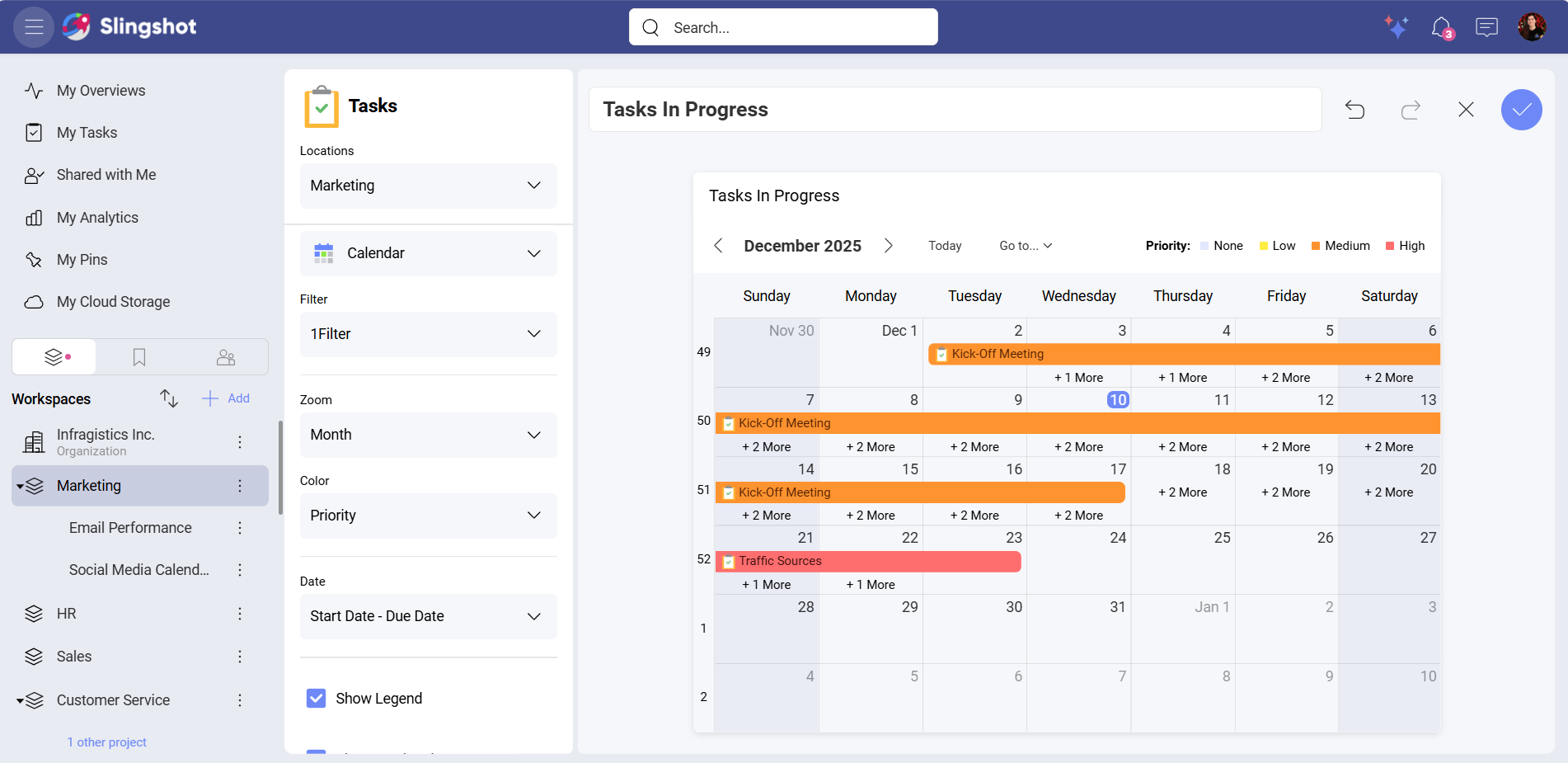
Calendar
You can use the Calendar visualization if you want the data to be distributed across days, weeks, or months.
For example, you want to see detailed information about all the tasks that are in progress in a workspace. To do that, you can:
Select Tasks In Progress from the list of widgets.
Open Locations and select the workspace.
Select the Calendar visualization.
Create a Status filter with In Progress value.
Open the dropdown menu of Zoom and select Month.
Choose Status or Priority for the Color. In our case, we chose Priority.
Select Start Date – End Date for Date.
Enable Legend. (optional)
Enable Weekends. (optional)
Enable Week Numbers. (optional)
Note
The Color element is available only for the widgets that are in the Task Management category as well as for custom tasks.
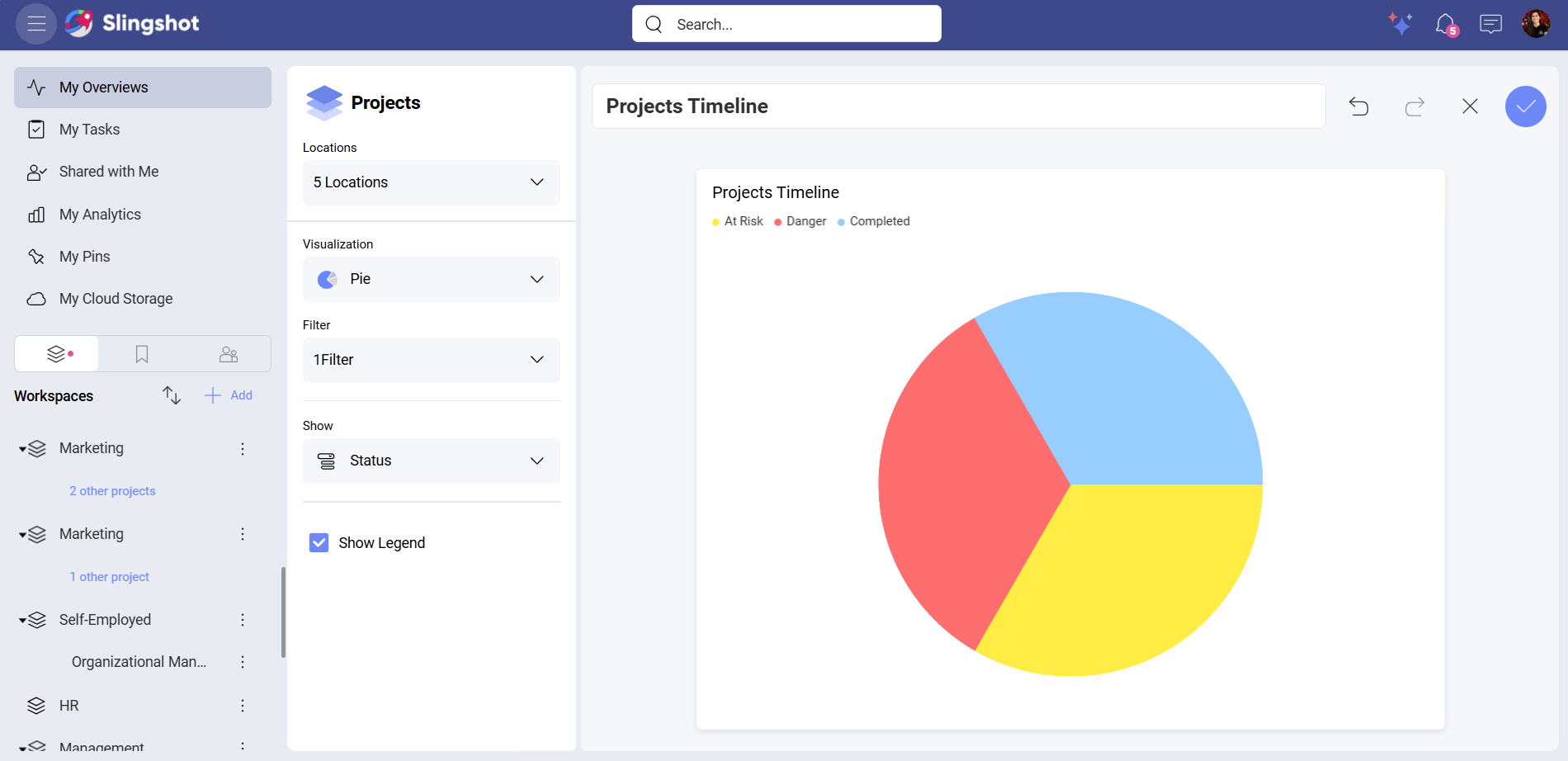
Project Widgets
The Projects category includes the following widgets: Projects Timeline and Open Tasks by Project. Each of them uses all nine visualizations except the Number visualization.
If you want a breakdown of all the projects started this month as well as their statuses, you can:
Select Projects Timeline from the list of widgets.
Open Locations and choose the projects you have in mind.
Choose a visualization. In our case, we chose the Pie chart. Depending on the chart type, you will be able to configure different elements.
Create a Start Date filter and choose This Month for its value.
Choose Status from the dropdown menu of Show.
Enable the Legend.
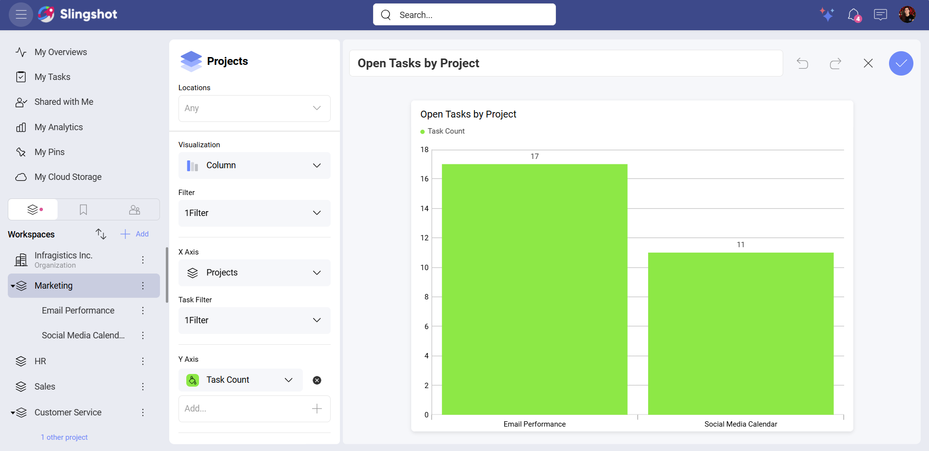
If you want to see a list of all the open tasks for each project that you are a part of, you can:
Select Open Tasks by Project.
Open Locations and choose the projects you have in mind.
Choose a visualization. In our case, we chose the Column visualization. Depending on the chart type, you will be able to configure different elements.
Open the dropdown menu of X Axis and select Projects.
Create a Status filter that excludes Completed tasks.
Add Task Count to Y Axis.
Enable the Legend.
Dashboard & Analytics Widgets
The Data Analytics category includes the following widgets: Dashboards, Pin from Dashboard, and My Favorite Dashboards (available only for My Overviews).
Note
The Pin from Dashboard widget doesn’t use visualizations. However, you can rename the pin, unpin the visualization or replace it.
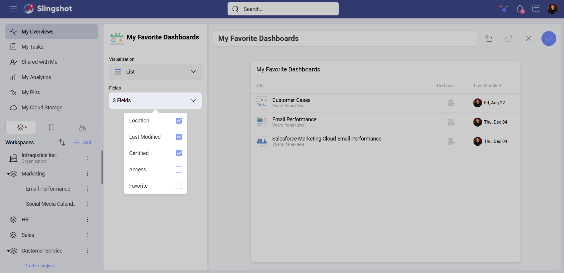
My Favorite Dashboards widget has two visualizations that you can choose from: List and Grid.
If you want to have quick access to all of your favorite dashboards, you can use the Grid visualization.
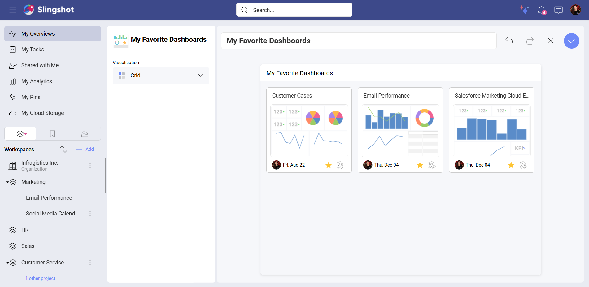
If you want to able to display fields, such as Location, Last Modified, Certified, Access or Favorite, you can use the List visualization.
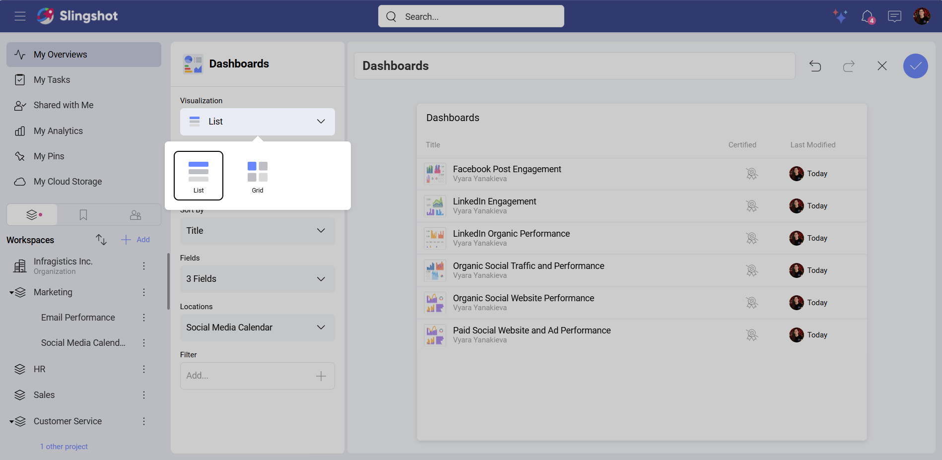
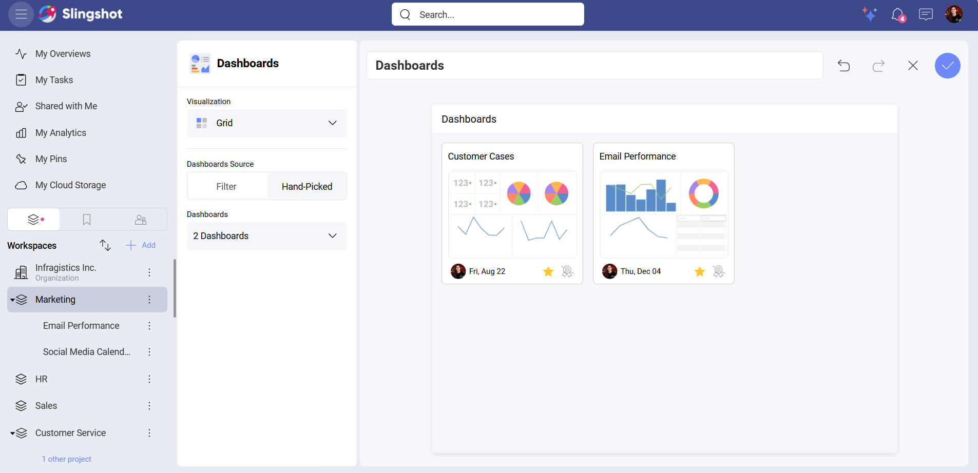
The Dashboards widget also has two visualizations that you can choose from: List and Grid. You can configure each of them in way that helps you make faster data-driven decisions.
Grid
There are two types of dashboard sources that you can choose from: Filter and Hand-Picked.
If you want to just filter dashboards, you can use the Filter source. For example, you want to see all the dashboards in your workspace that were modified this week. To do that, you can:
Select the Grid visualization.
Select Filter under Dashboards Source.
Choose a Location to select the workspace.
Create a Last Modified filter with a value This Week.
If you want to hand-pick dashboards, you can:
Select the Grid visualization.
Select Hand-Picked under Dashboards Source.
Add dashboards.
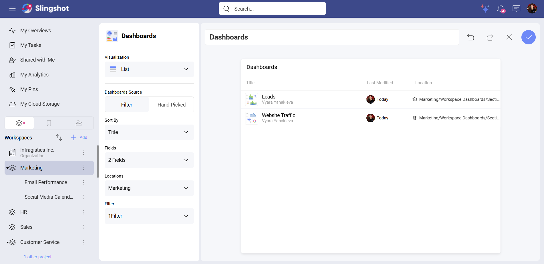
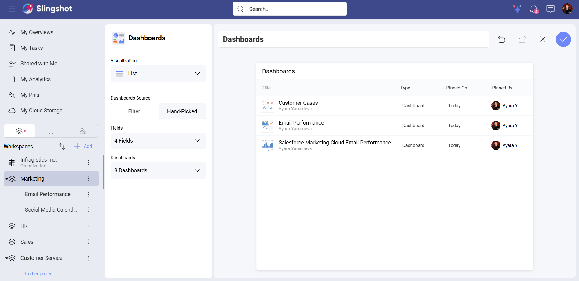
List
The List visualization is also divided into two types of dashboard sources: Filter and Hand-Picked.
If you want to sort dashboards as well as add fields to the list, you can choose the Filter source.
For example, you want to see in a list of all the dashboards that are in a specific workspace. You also want to see just the ones that were modified this month. To do that, you can:
To do that, you can:
Select the List visualization.
Select Filter under Dashboards Source.
Open the dropdown menu of Sort By and select Title.
Open Fields and choose Location and Last Modified.
Select a workspace.
Create a Last Modified filter with a value This Month.
If you want to add fields to the list of hand-picked dashboards, you can:
Select the List visualization.
Select Hand-Picked under Dashboards Source.
Open the dropdown menu of Fields to select which fields to display.
Add the dashboards.
Custom Widgets
There are three types of custom widgets:
• Tasks: When you create custom tasks, you can choose between all the visualizations mentioned above. You can include custom tasks in workspace and project overviews as well as in the overviews in My Overviews.
• Projects: When you create custom projects, you can choose between all the visualization types mentioned above except Number. You can include custom projects in workspace overviews as well as in the overviews in My Overviews.
• Workspaces: When you create custom workspace, you can choose also between all visualization types mentioned above except Number. You can include custom workspaces in the overviews in My Overviews.
Note
Custom Projects and Workspaces don’t have an option to configure Color while using the Timeline or the Calendar visualization.
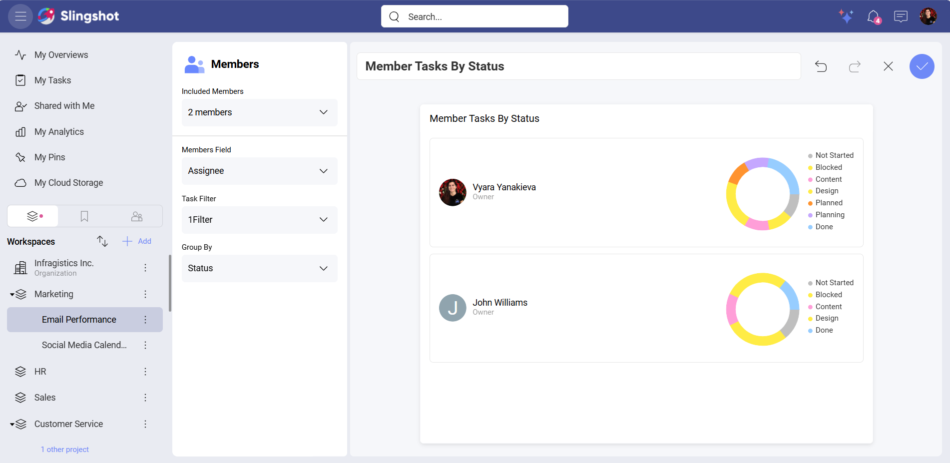
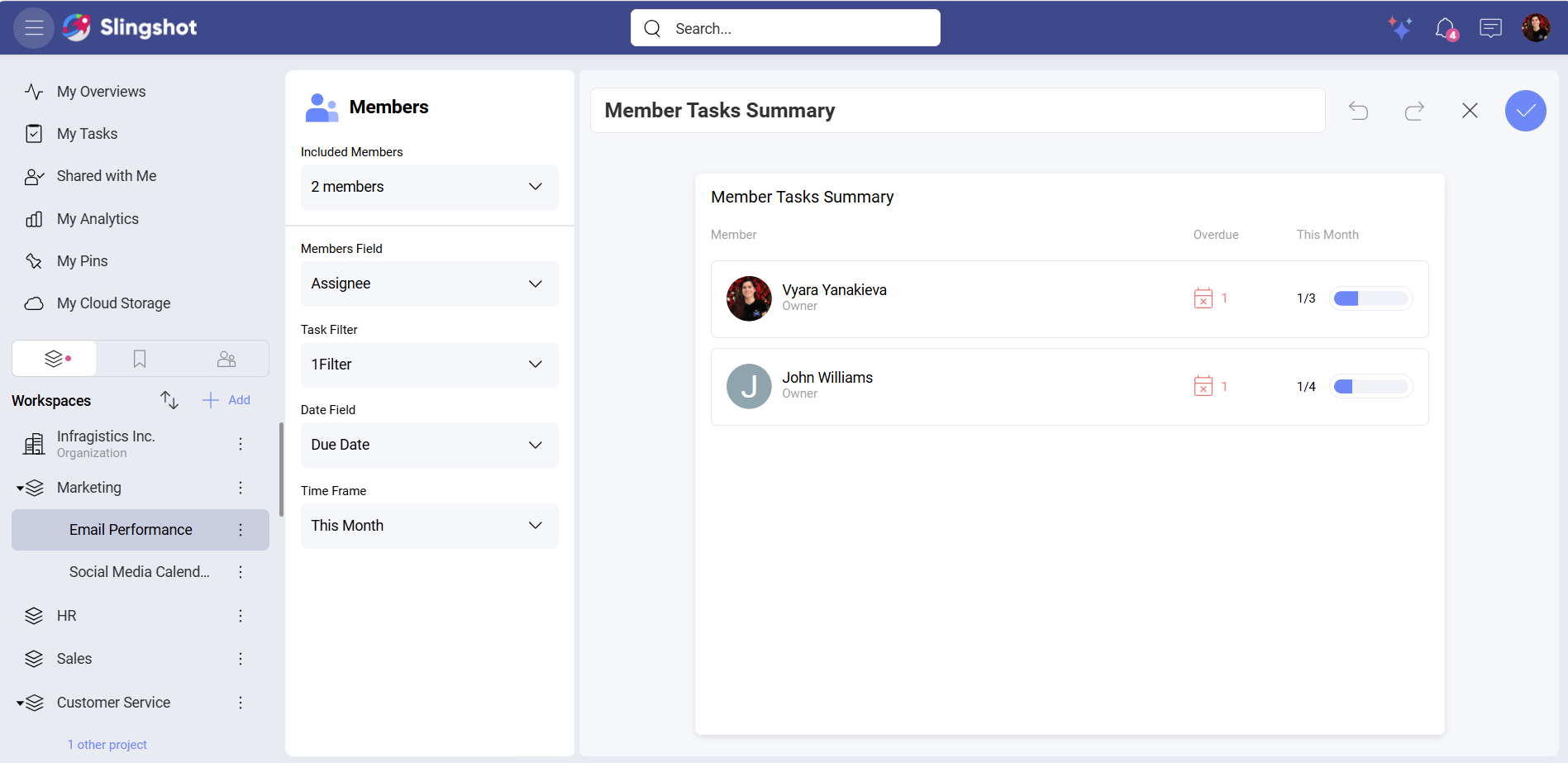
Member Widgets
There are two types of member widgets: Member Tasks Summary and Members Tasks By Status. Both widgets don’t use visualization types. However, you can still configure their elements in order to display important information.
If you want a breakdown of all the overdue tasks for this week that your team is currently working on in a project, you can:
Select Members Tasks Summary from the list of widgets.
Select members to include in the task’s summary.
Select your workspace.
Create a Priority filter with a High value.
Select Due Date for the Date Field.
Select This Month for the Time Frame.
If you want to distribute the high priority tasks in your project equally among your team members, you can:
Select Member Tasks By Status from the list of widgets.
Select members to include in the task’s summary.
Group the tasks by Status.
Create a Task Filter with High value.